Designers/Researchers: Anika Hagen and Jenna Silverman
Tools: Figma, User Research, A/B Testing
Timeline: August 2022 - April 2023
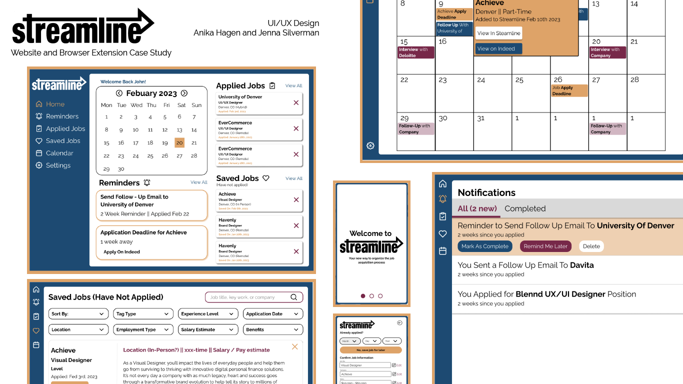
Problem Statement: College graduates need a more effective way to organize the job acquisition process from application to hire. Streamline helps post-graduate students apply for jobs, keep track of deadlines, schedule interviews and make the best first impression all in one place.
User Research
Interviews
Target Audience:
Goals:
Learn the ways college students currently organize their job search process, see which job-search sites are the most popular among post-graduate students, and discover other pain points in the job acquisition process.
Methodology:
Six 30 minute interviews, conducted either on zoom or in person depending on the interviewee’s location and availability.
Participant Screening:
- Age Range: 21 - 25
- Has graduated or is about to graduate undergraduate school
- Currently uses or has used job-search websites
Sample Interview Questions:
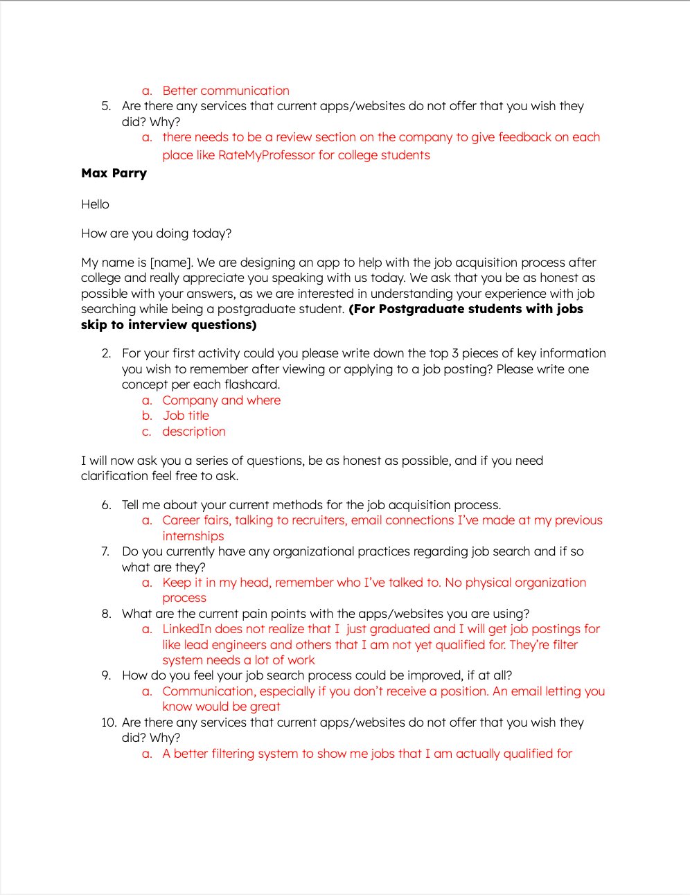
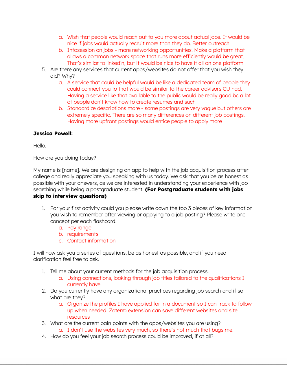
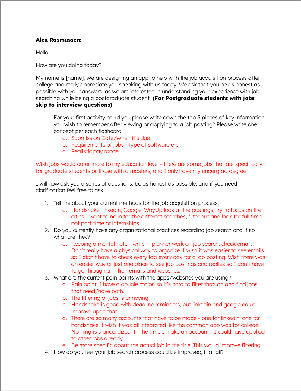
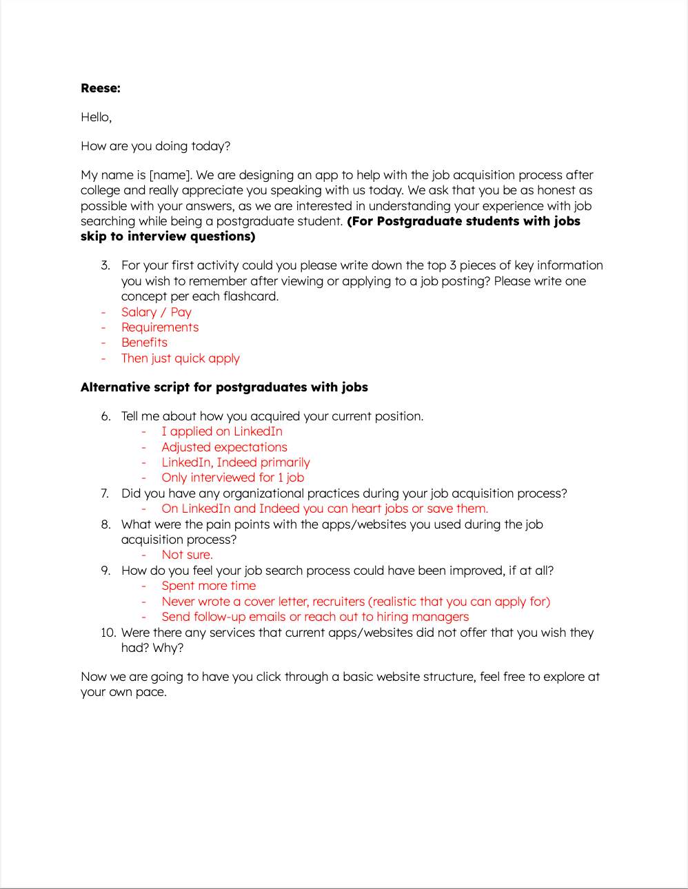
1. Tell me about your current methods for the job acquisition process.
2. Do you currently have any organizational practices regarding job search and if so what are they?
3. What are the current pain points with the apps/websites you are using?
4. How do you feel your job search process could be improved, if at all?
5. Are there any services that current apps/websites do not offer that you wish they did? Why?
User Interviews:
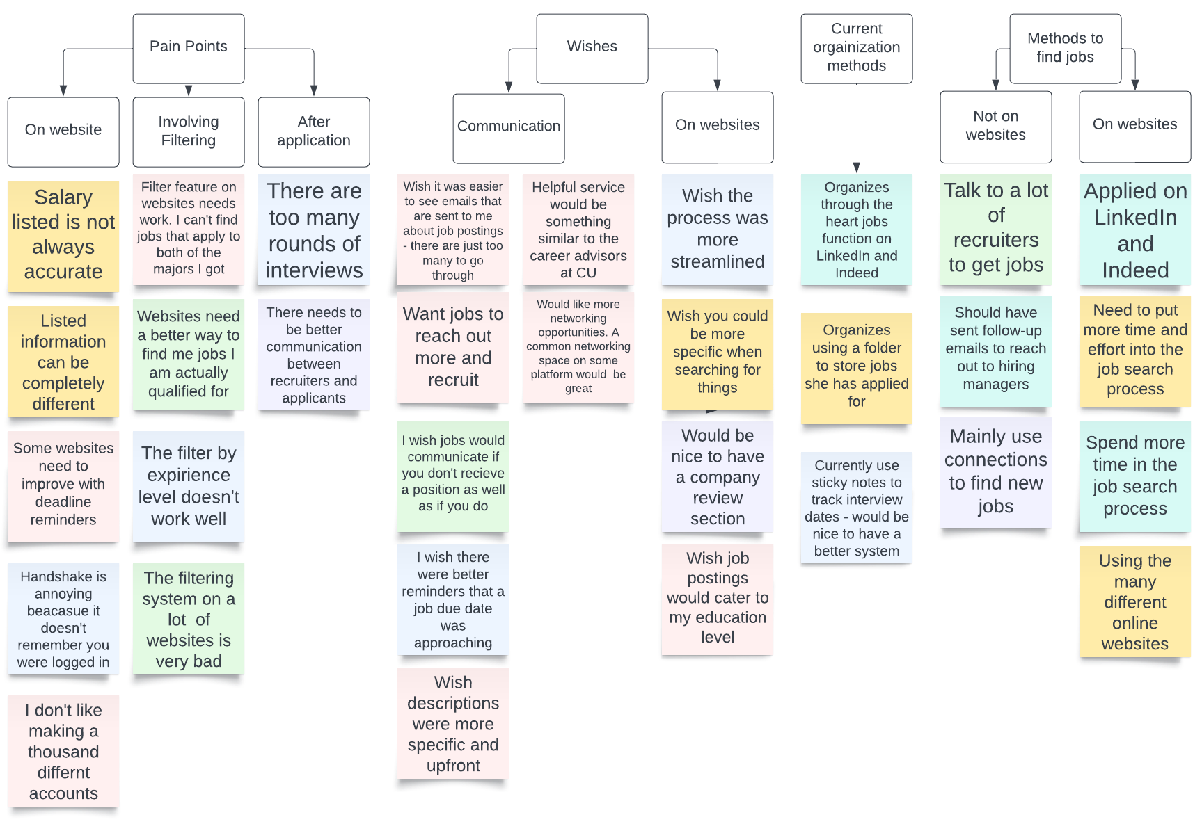
"I wish there was an easier way or just one place to see job postings... so I don’t have to go through a million emails and websites."
"Nothing is standardized. In the time I make an account - I could have applied to other jobs already"
"I wish there was a way to get a better reminder that a job due date was approaching"
Below is just a snippet of the copious notes we took during user interviews.
From these interviews we created affinity maps to sort each of the user's answers into categories.
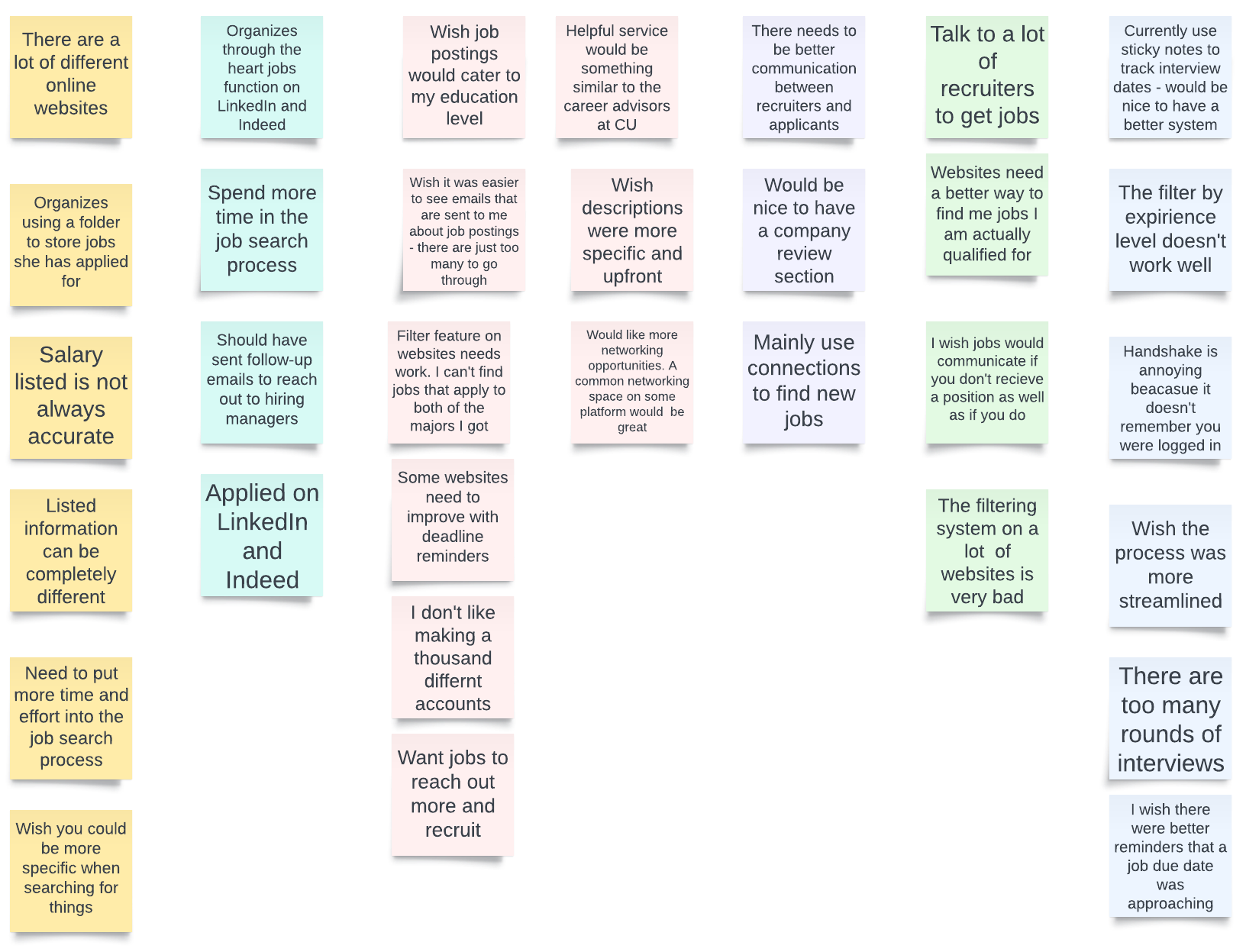
First iteration
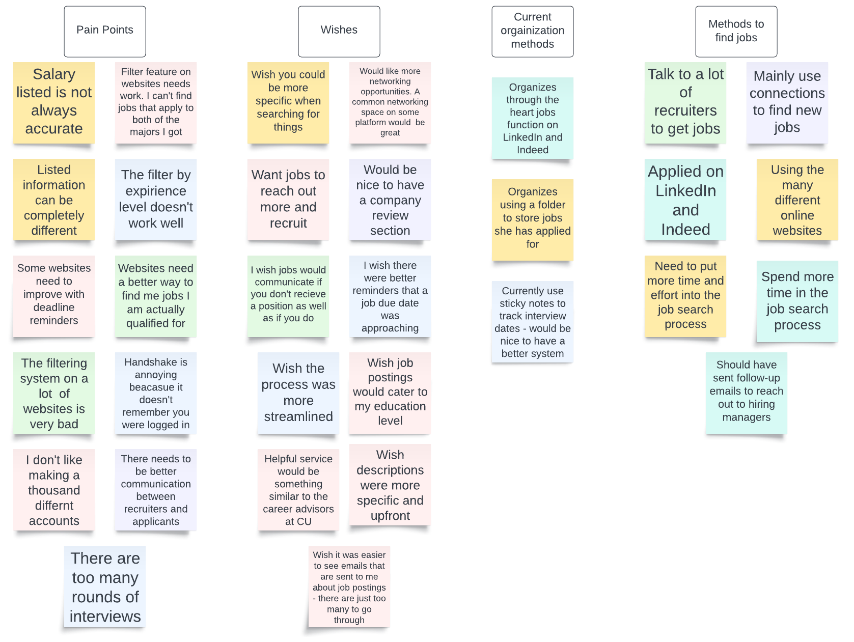
Second iteration - with categories
Third iteration - with more categories
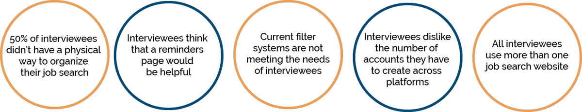
Interview Findings
How might we...
How might we create one website to organize all of the different jobs a user wants to save?
How might we create a website that keeps tracks of and creates reminders for due dates?
Surveys
Goals: Learn which of the popular websites postgraduate students are using the most .
Methodology: Our research will be conducted through a survey sent out to different post-graduate students. The survey should only take a maximum of five minutes.
Participant Screening:
- Age Range: 21 - 25
- Has graduated or is about to graduate undergraduate school
- Currently uses or has used job-search websites
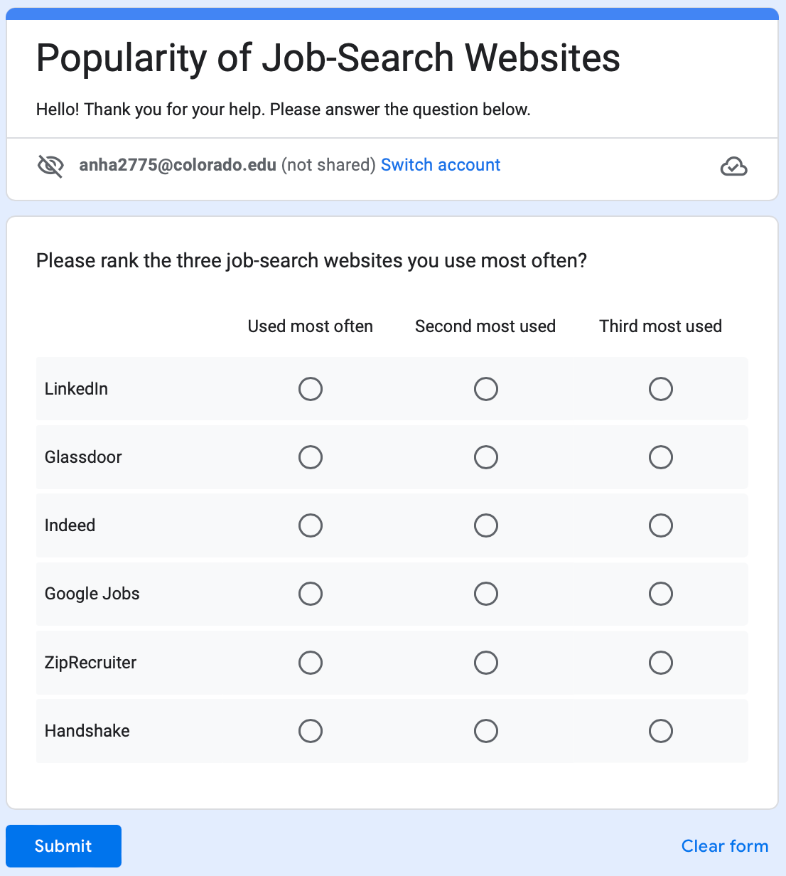
Survey screenshot
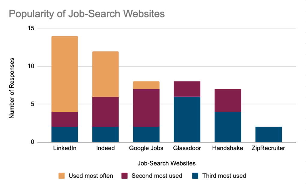
Survey results
We had 17 people respond to the survey which showed that LinkedIn and Indeed were the two most used job-search websites.
Technical Research
As UI/UX designers, we wanted to ensure the feasibility of this project when it is handed off to the developers. We were mainly concerned with whether they would be able to scrape a job-search website with our browser extension to auto-fill the information on our website.
We interviewed a local web-scraping expert at the University of Colorado: Anthony Pinter, informing us that using a website's API would be the most efficient way to get information from a website, rather than scraping.
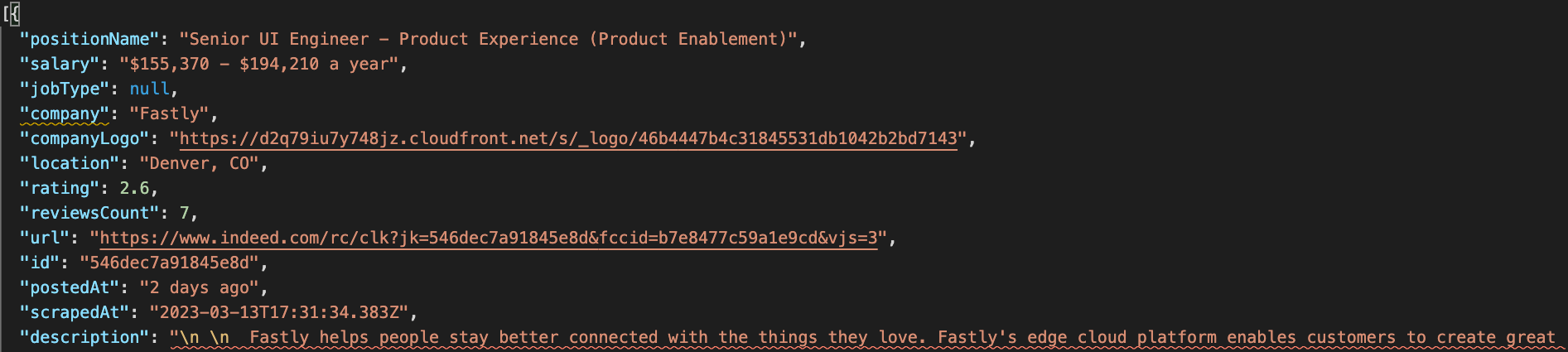
After discovering that Handshake was the only job search website without a free and available API, I was able to use the website APIFY to scrape the data from Indeed and import it into a JSON file. This proves that our browser extension and website will be successfully implemented by developers.
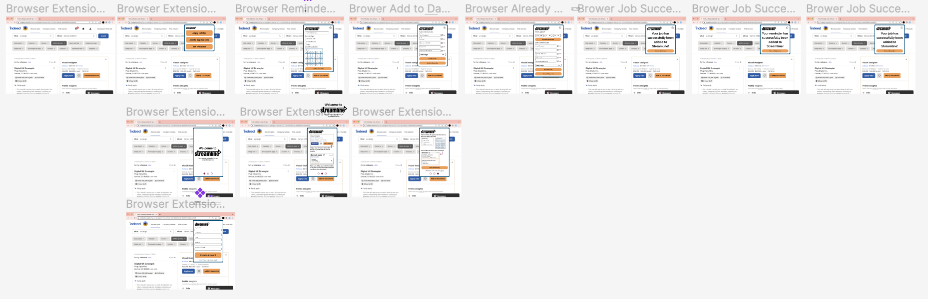
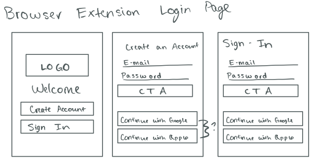
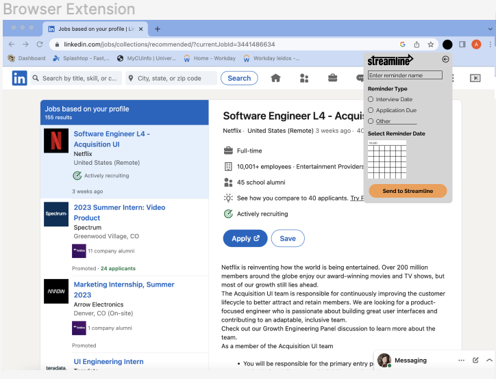
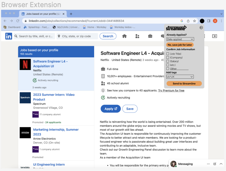
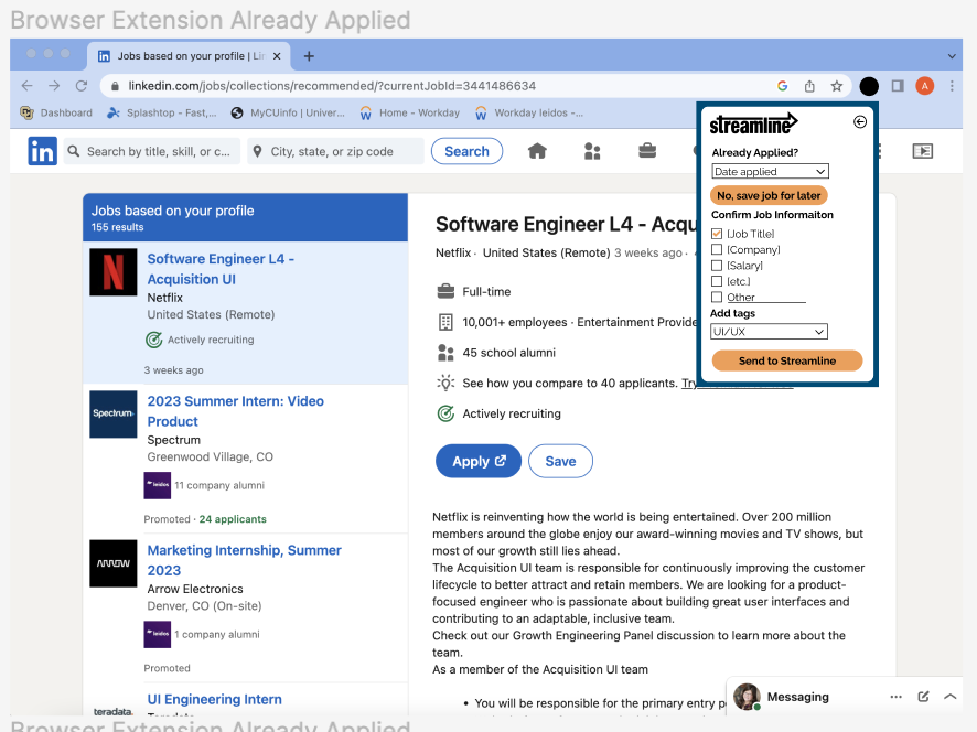
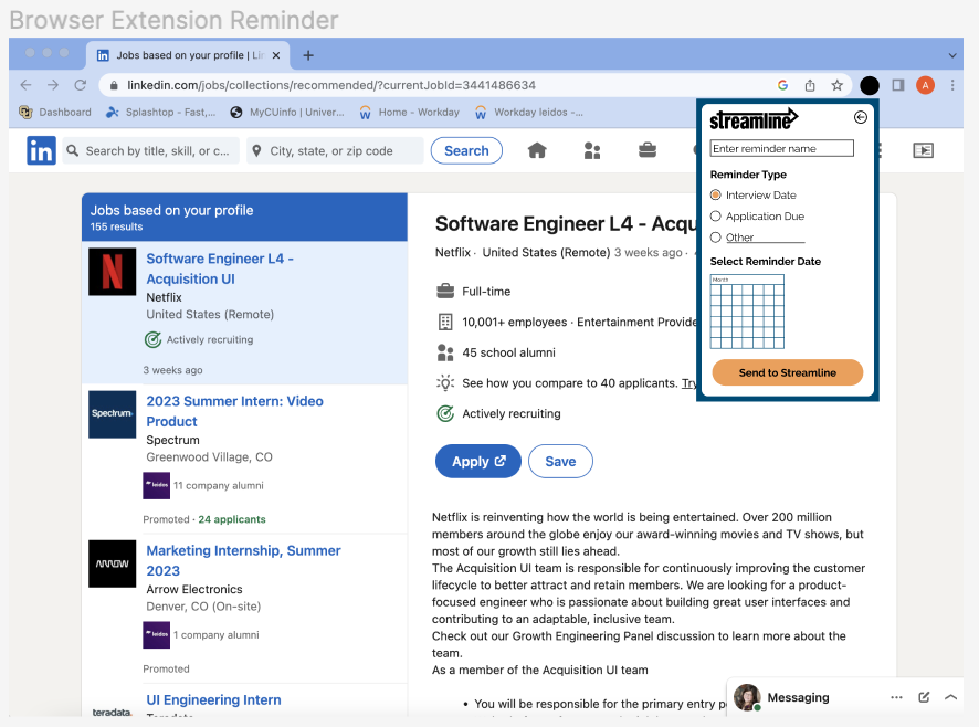
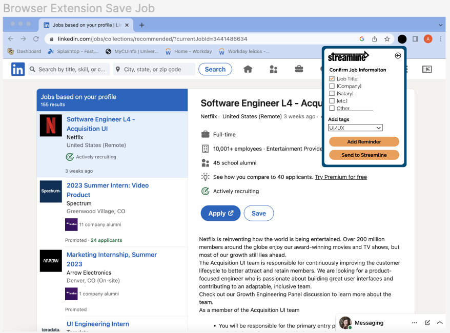
Bowser Extension Design
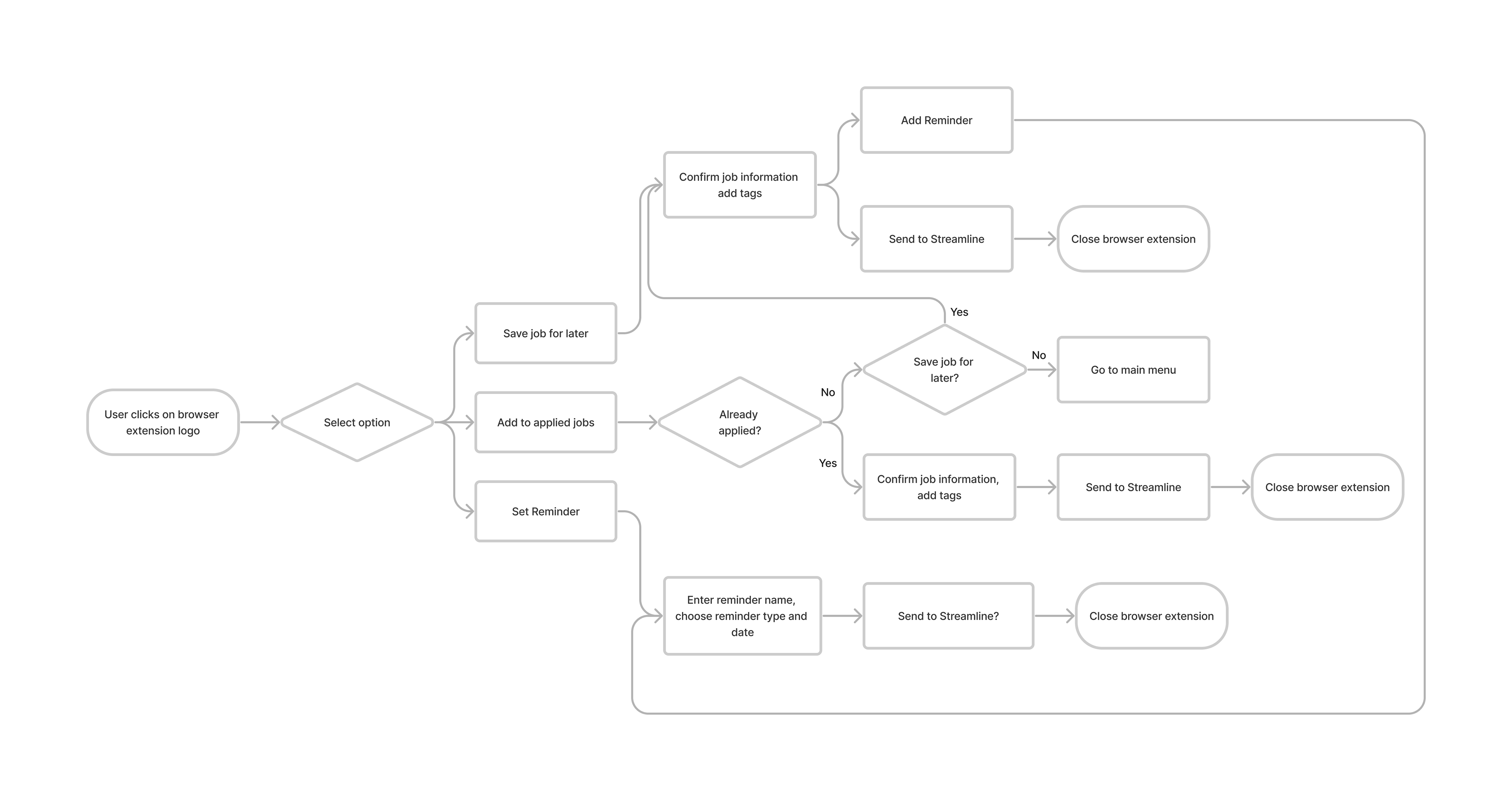
To begin designing, we started with a user flow diagram for our browser extension.
User Flow Diagram:
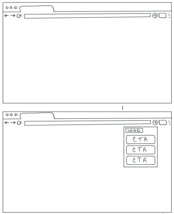
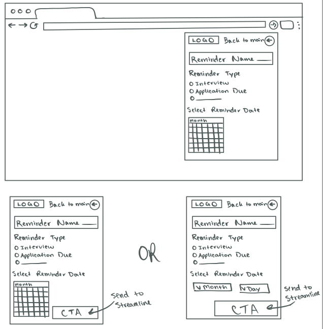
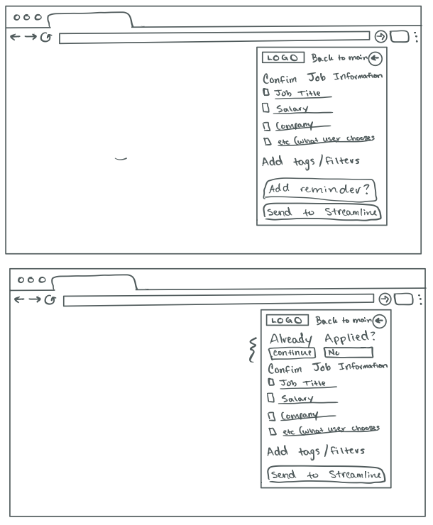
From there, we created low and mid fidelity wireframes
Low Fidelity
Low-fidelity
Low-fidelity
Low-fidelity
Low-fidelity
Low-fidelity
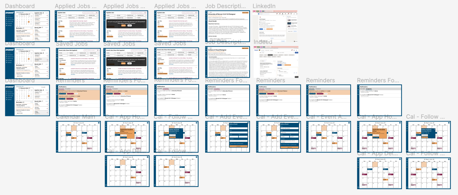
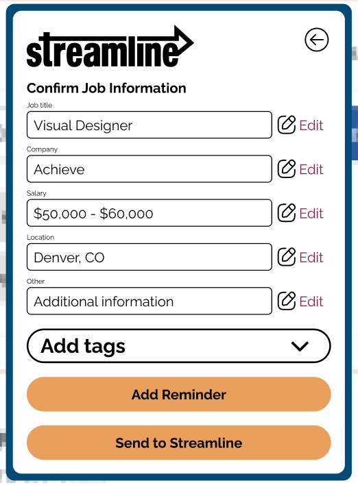
Mid Fidelity
Mid-fidelity
Mid-fidelity

Mid-fidelity
Mid-fidelity
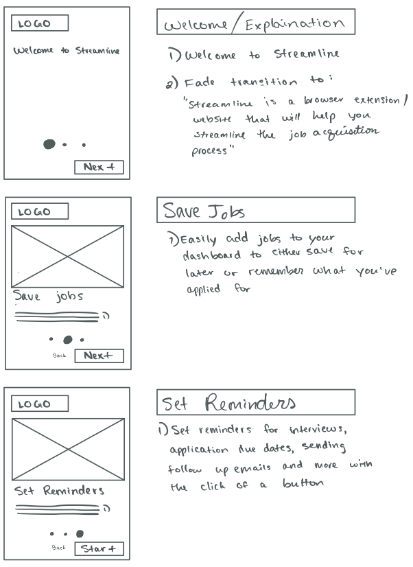
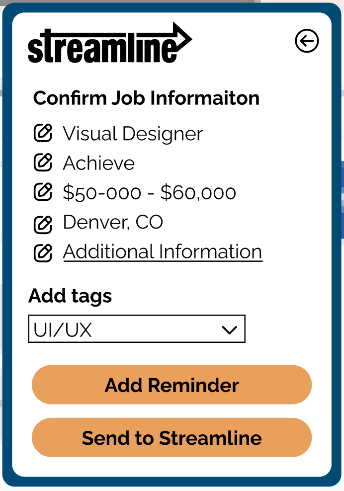
First phase high-fidelity
A/B Testing
After collecting user feedback, many changes and integrations were created. We used A/B testing to test different varieties of an edit button on the apply for jobs feature. Below are the three variations that were used in A/B testing.
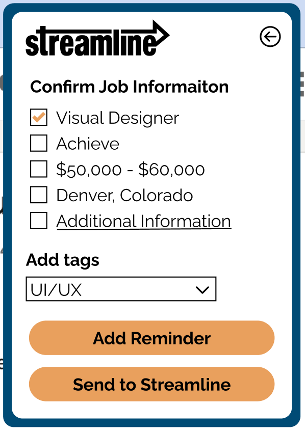
The center design was the most popular. Users expressed that it was easier to understand because of the word "edit" next to the pencil icon.
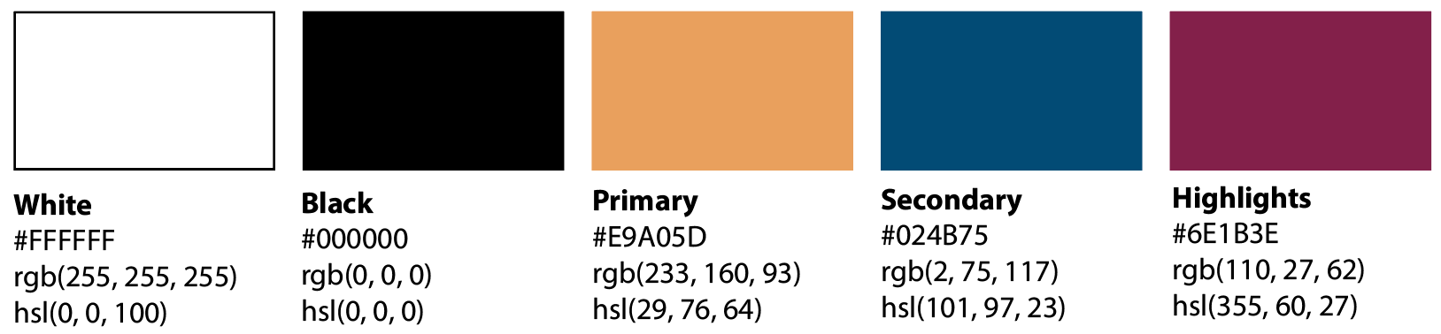
For the website itself, we also conducted A/B testing to see which color pallates the users preferred.
The users we interviewed didn't love either color choice but they expressed that they liked having a neutral, modern background with the pops of bright colors. Based on this information, we created the final brand kit.
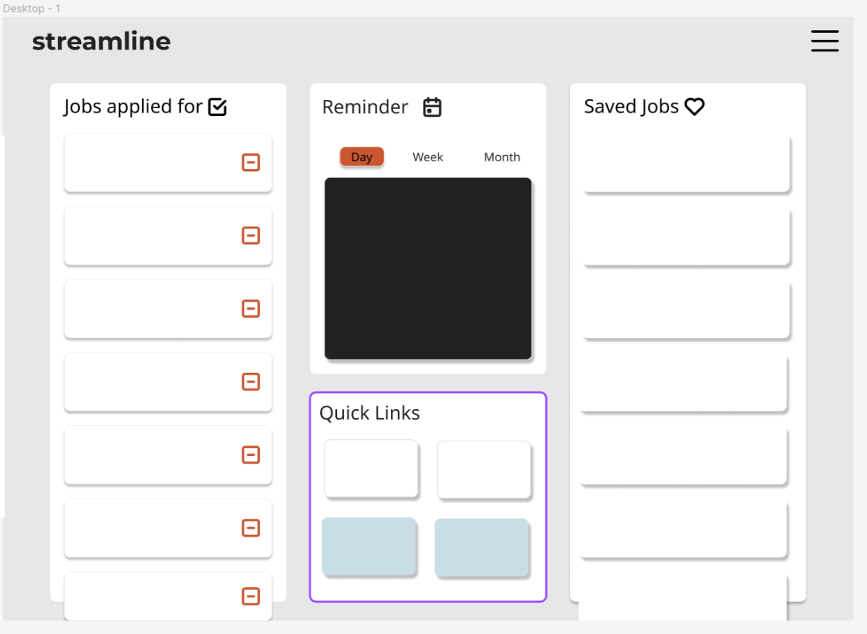
Mid-fidelity wireframes
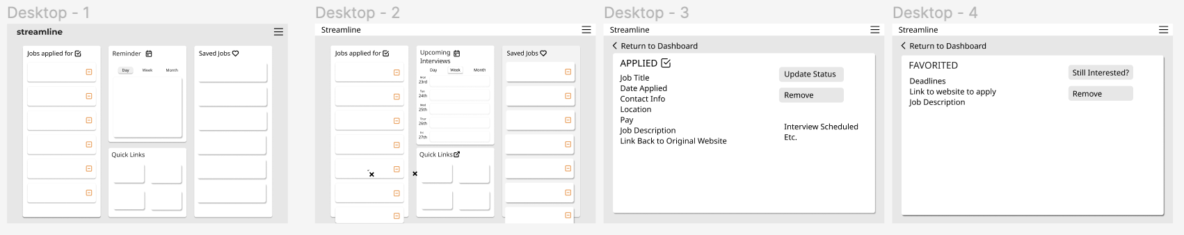
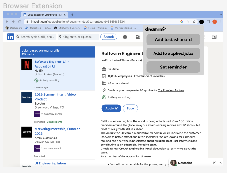
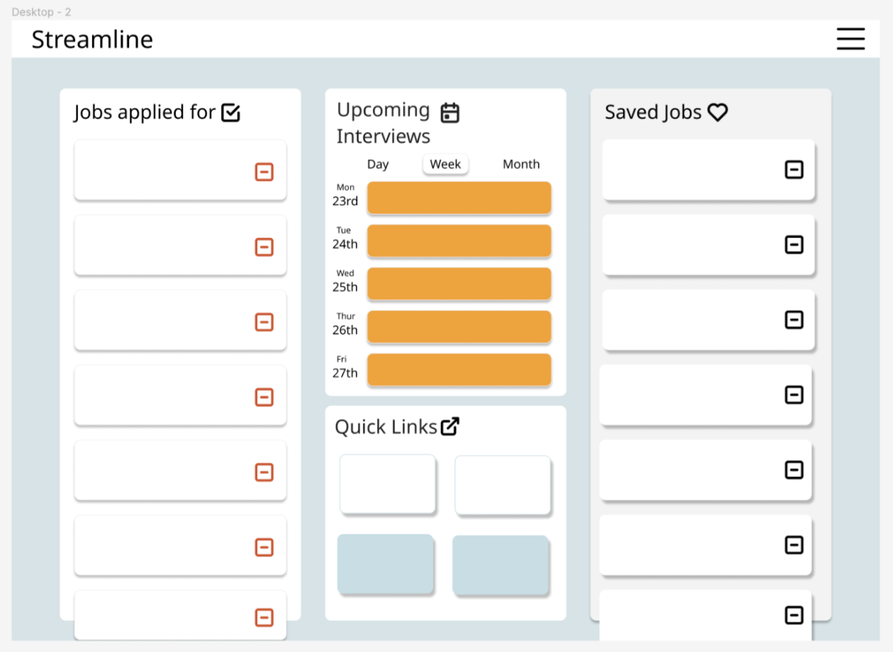
High fidelity wire frames