The following case study explores the redesign of the Denver Zoo's website.
Sole Designer/Researcher: Anika Hagen
Tools: Figma, UXMetrics
Timeline: January - May 2023
Summary: This case study explores the redesign of the Denver Zoo's website, specifically the ticket flow, home page, and membership information page. The final redesign presents a more intuitive and aesthetically pleasing solution to the current website's problems.
Challenge: Currently the Denver Zoo's website is not user friendly. Two of the main problems are the navigation bar and the ticket flow. As it currently stands, the ticket flow is aesthetically inconsistent with the rest of the website and not at all intuitive. Additionally, the navigation bar is overly complex, providing too many options that can be overwhelming for users and detract from their experience on the site.
Research
UX Evaluation
To begin research for this project, it began with a UX Evaluation of the current website. Using an Excel template with different criteria to fill out, I was able to determine the main issues with the Denver Zoo's current website from a UX perspective. Not only were there problems with accessibility, but below you can see some of the other issues that I identified.
Home Page Problems:
The number of items in the main navigation is unreasonable. There are more than 8 navigation items and many navigation items have more than 8 sub items.
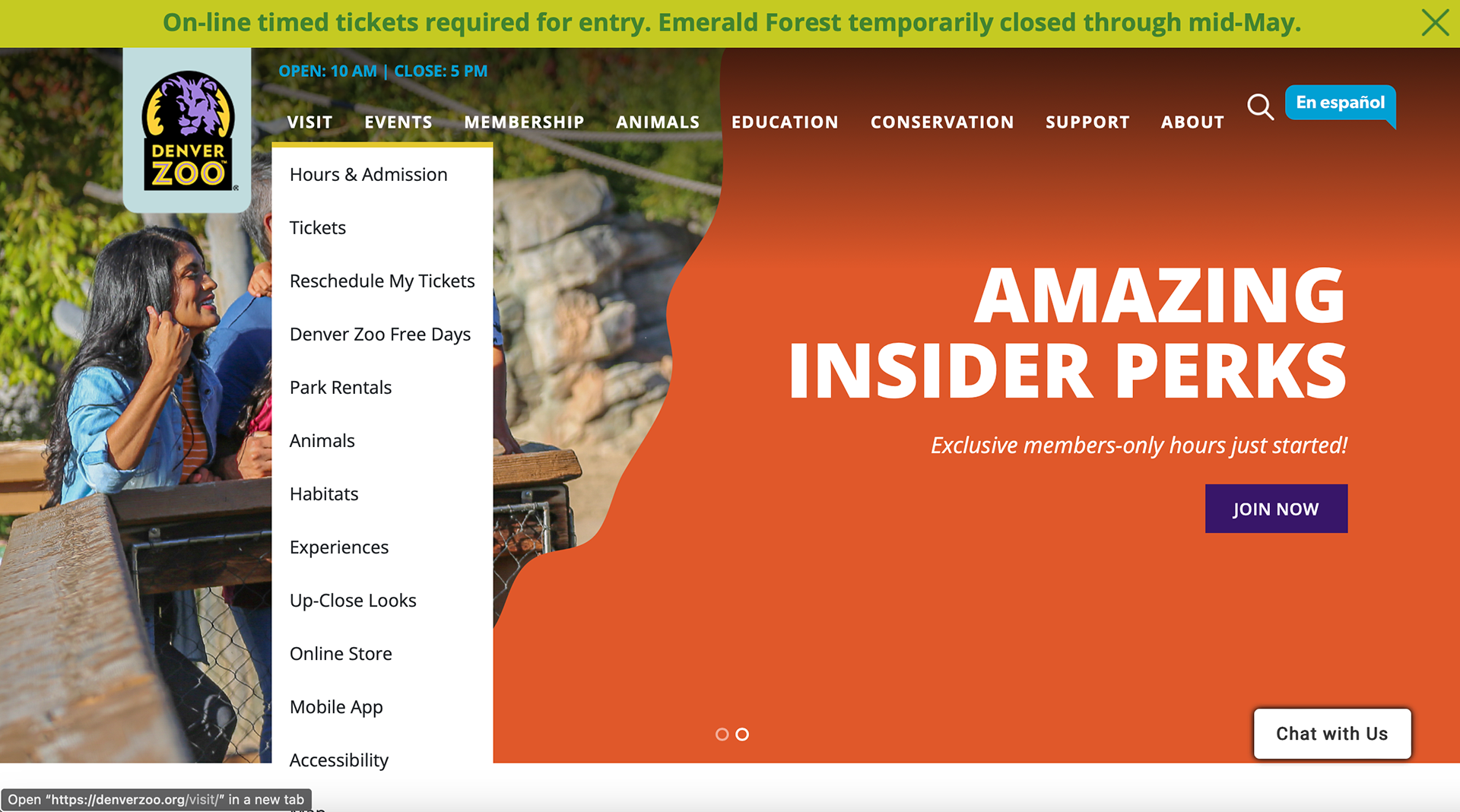
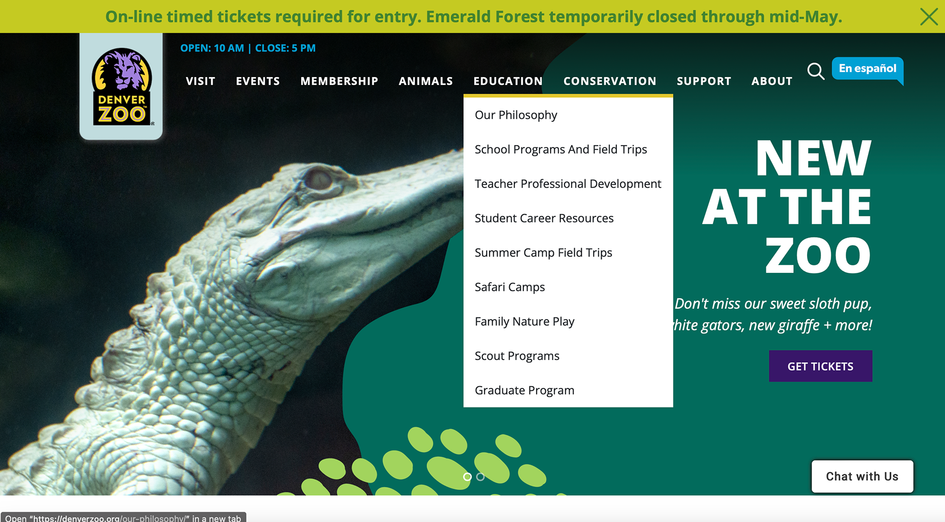
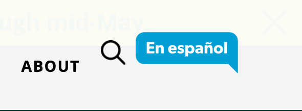
Icons are NOT only used to enhance labeling and DO stand on their own. The search bar specifically is an icon that stands on its own without any label to explain its purpose.
Ticket Flow Problems:
Sequences of actions are organizaed into groups with a beginning, middle, and end. Throughout the ticket flow, the organized sequence is always changing and there is never a clear end to the sequence.


Card Sort
I and others completing a redeisgn of the Denver Zoo completed a card sort test to determine which subcategories of the main navigation should go to which main category and which sub categories were unnecessary. Many of the subcategories that are currently on the zoo's website were repeated in several of the main categories, this is unnecessary. Once this card sort was completed, my peers and I were able to compare our different sorts and see what was similar.
Site map
Using the card sort mentioned above, and after a long discussion and debate upon which items belong to which main navigation categories, a sit map was created (view below). This site map included the final items that would be included in the redesign's main navigation. As you can see, now each of the categories contain less than 8 subcategories. While there are more than 8 main categories, we felt this was necessary to sort all of the needed information.
Tree Test
Using the above site map, I created a tree test and had five different users complete the test to see if the subcategories and the way we had sorted them was intuitive for users.
The results had a lower success score than I expected, but all of the outcomes made sense after reviewing them. People found it confusing that there were two different categories involving camps when asked where they would find summer camps.
Besides the below task, the Tree Test had an overall positive success score.
Design
Design systems pattern audit
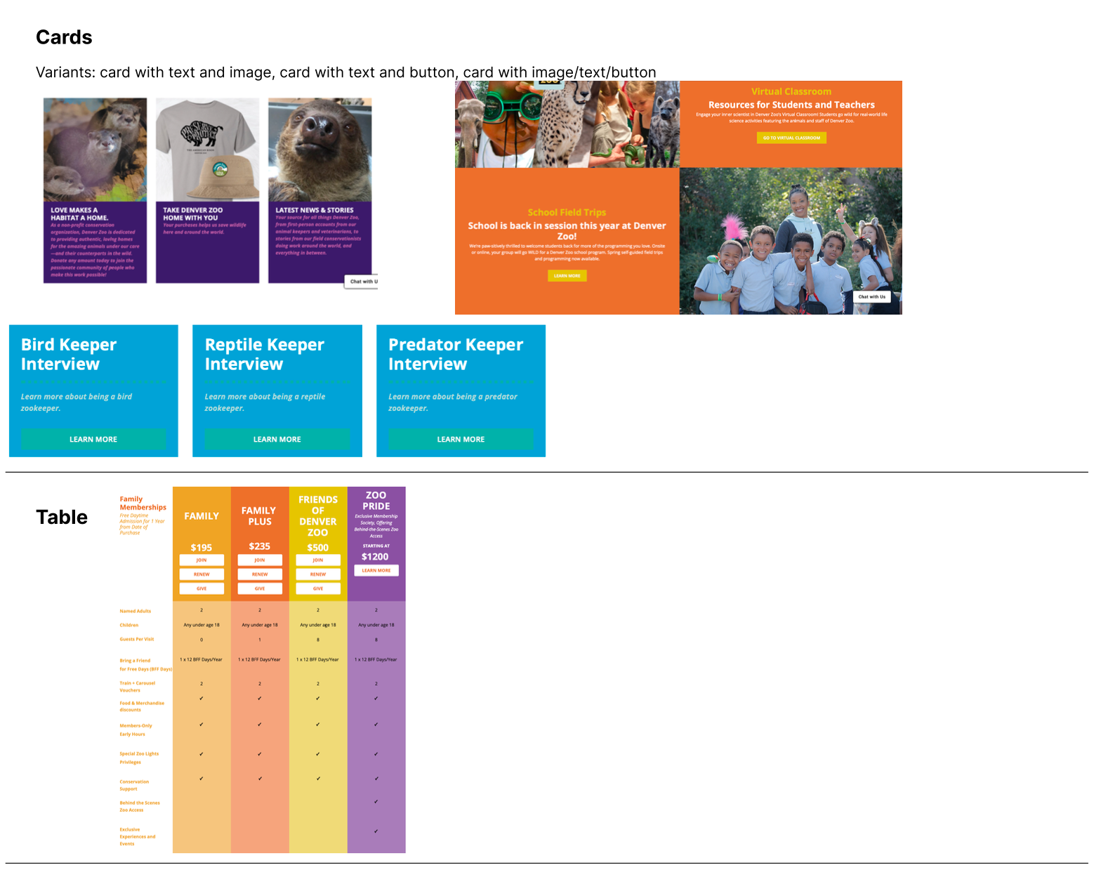
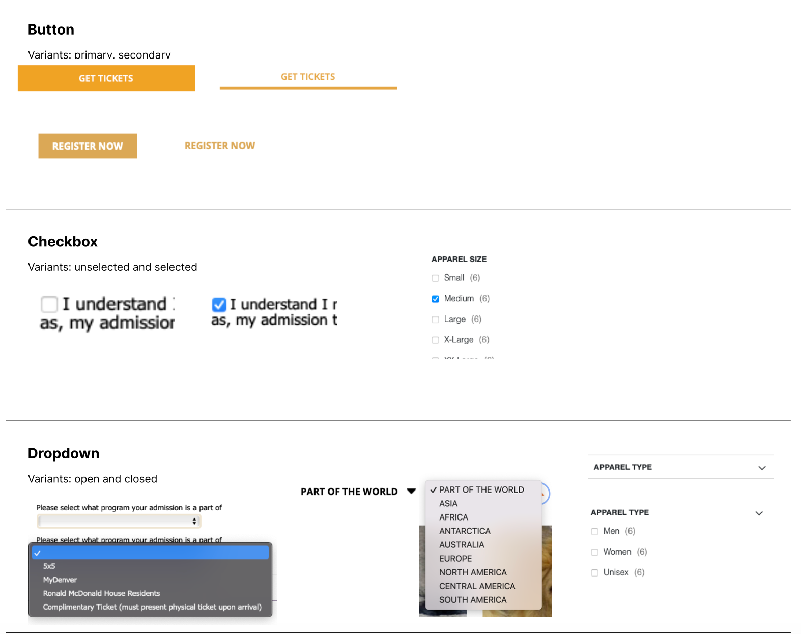
For this part of the design, I searched through many different pages of the Denver Zoo website to find the different elements they reuse on their website. This includes things from reused icons, buttons, typography, and many others. This ensured that I could keep the redesign similar to the current website using the different patterns.
You can see an example of some of the design system patterns I reviewed and gathered below.
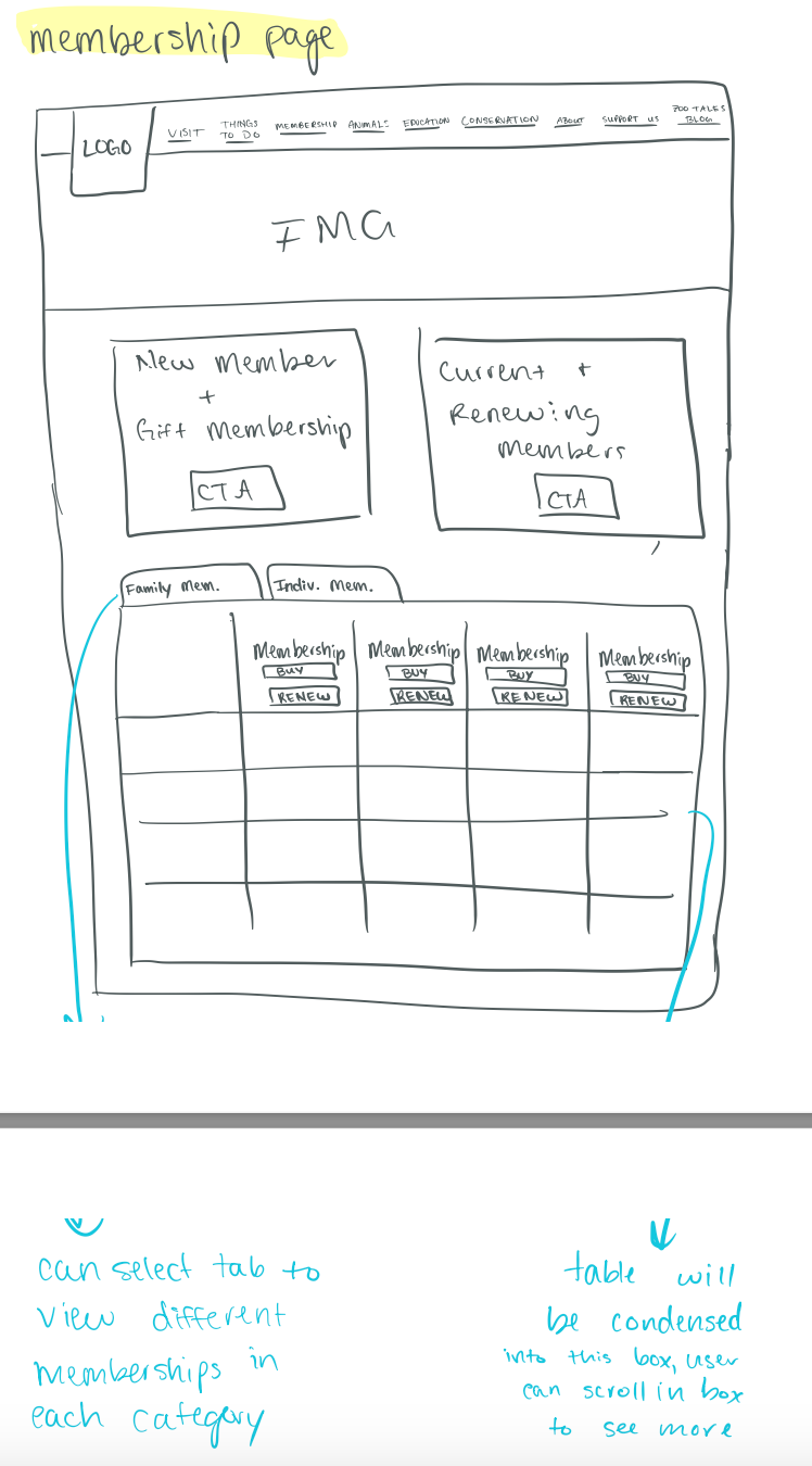
Annotated low fidelity wireframes
Using the three "How might we statements":
- How might we create a more organized and intuitive ticket purchasing experience?
- How might we display available time slots in a less overwhelming way?
- How might we get rid of unnecessary steps in the checkout process?
I was able to create annotated low fidelity wireframes for the homepage, membership page, and general admission ticket flow. The annotations are meant to give more context into the design decisions I was making.
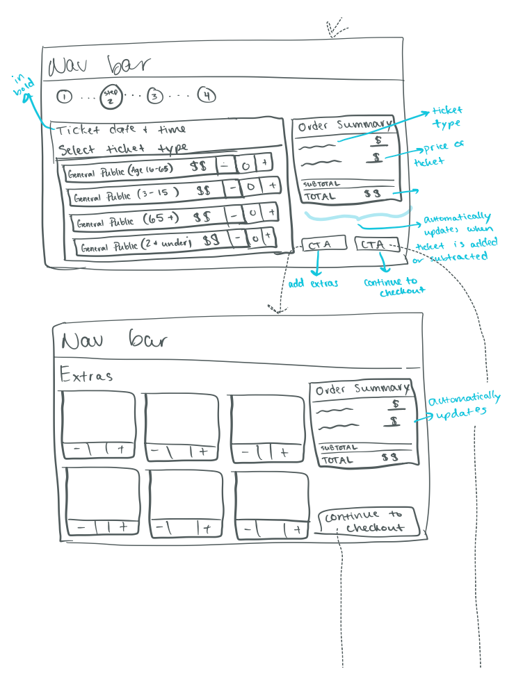
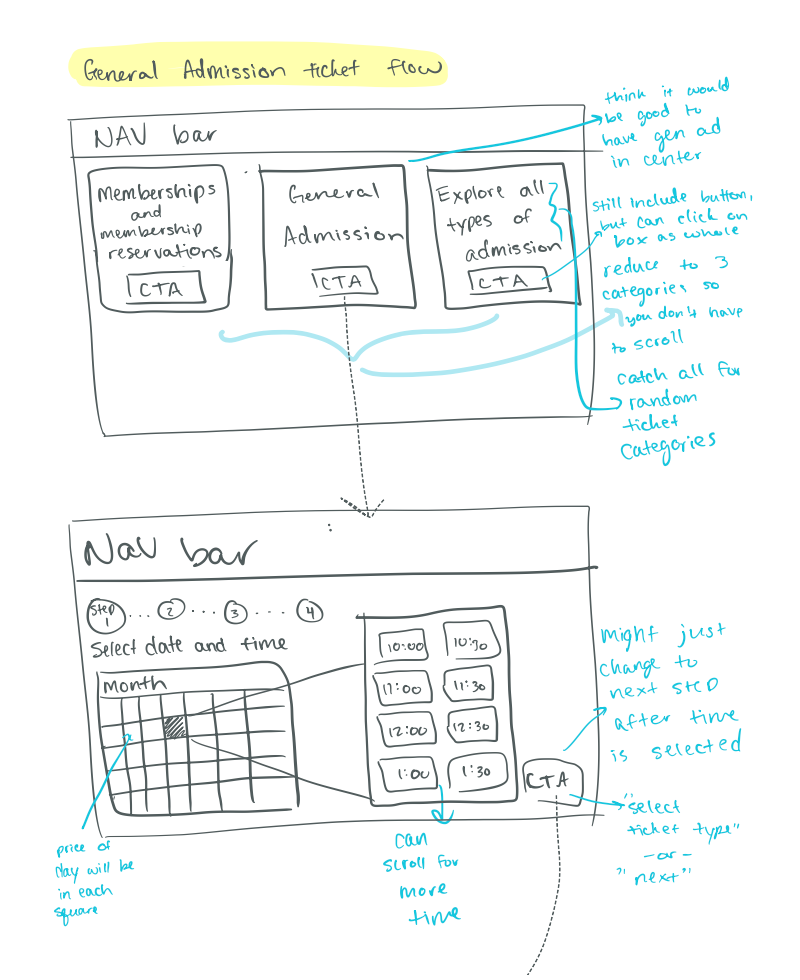
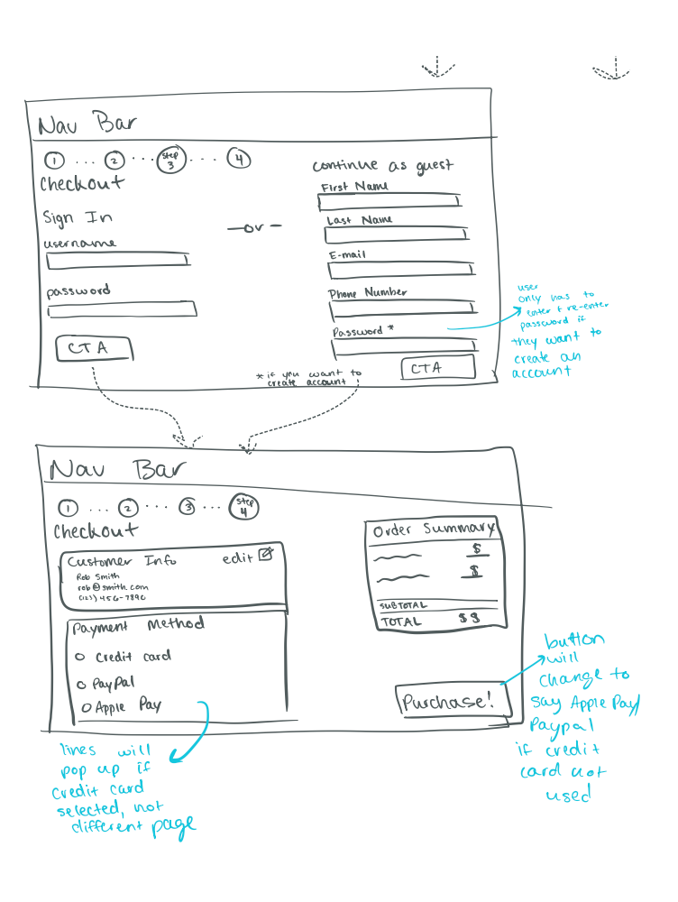
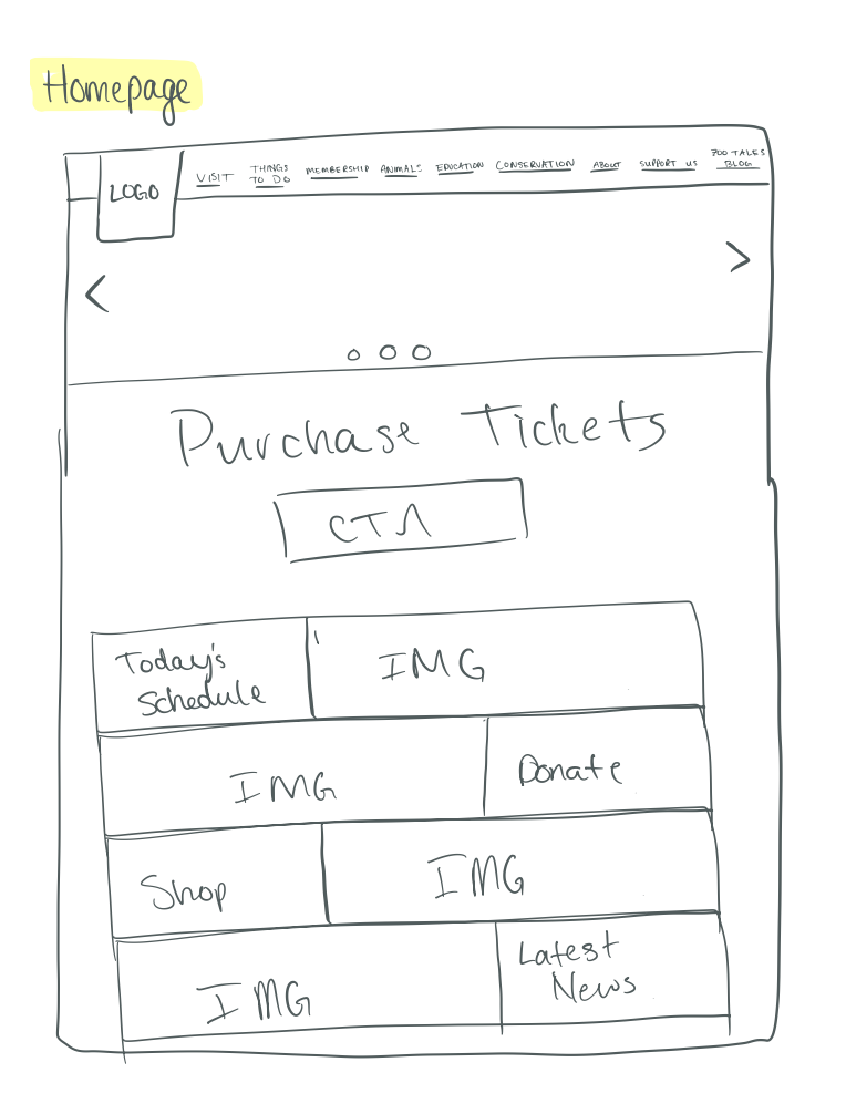
First Draft High Fidelity Wireframes
Using the above wireframes and feedback from my instructor, I was able to create the first draft of my high fidelity wireframes. Some key feedback for the low-fidelity wireframes included:
- trying to fit all of the ticket time and date information on one page so the user wouldn't have to scroll
- moving the number of ticket selection before the date and time selection to ensure that the number of tickets a user wanted were available that day
- including a confirmation screen after users had purchased their tickets.
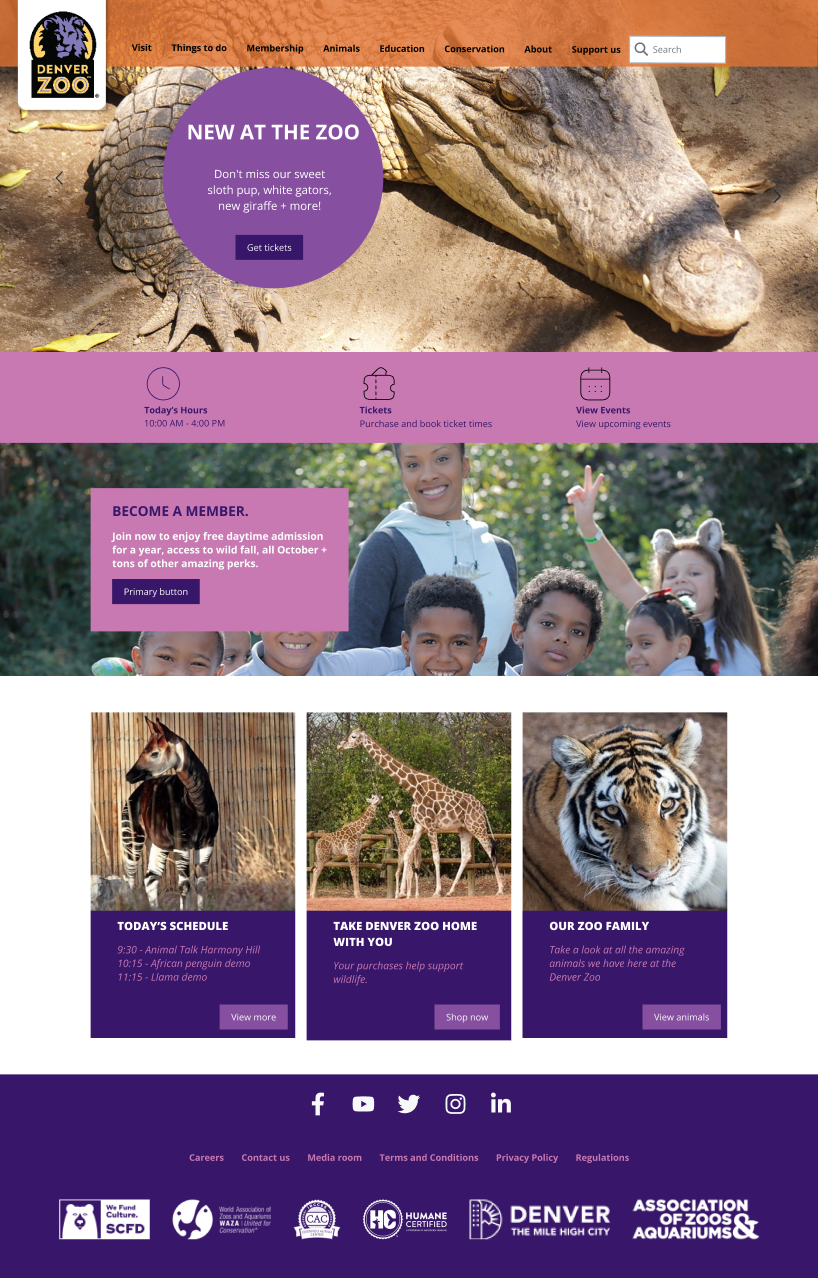
Below you can see clips from my first high fidelity wireframe drafts I created. For this first draft I really stuck to the blocky, bright color theme that the Denver Zoo had on their website. Something that I later discovered would probably be best if it was changed.


Instructor Feedback
After submitting my first draft of high fidelity wireframes, I received some great feedback from my instructor. Below you can see the before and after of some of the feedback and design changes.
Beginning with some simple changes, the membership page still felt a little busy even after my redesign of the chart that was on the page. It was suggested to get rid of the green box, so I added this suggestion and made the background of the chart a lighter color. I tried making the chart background white as well, but I didn't love how it turned out, so I just made it a lighter gray.
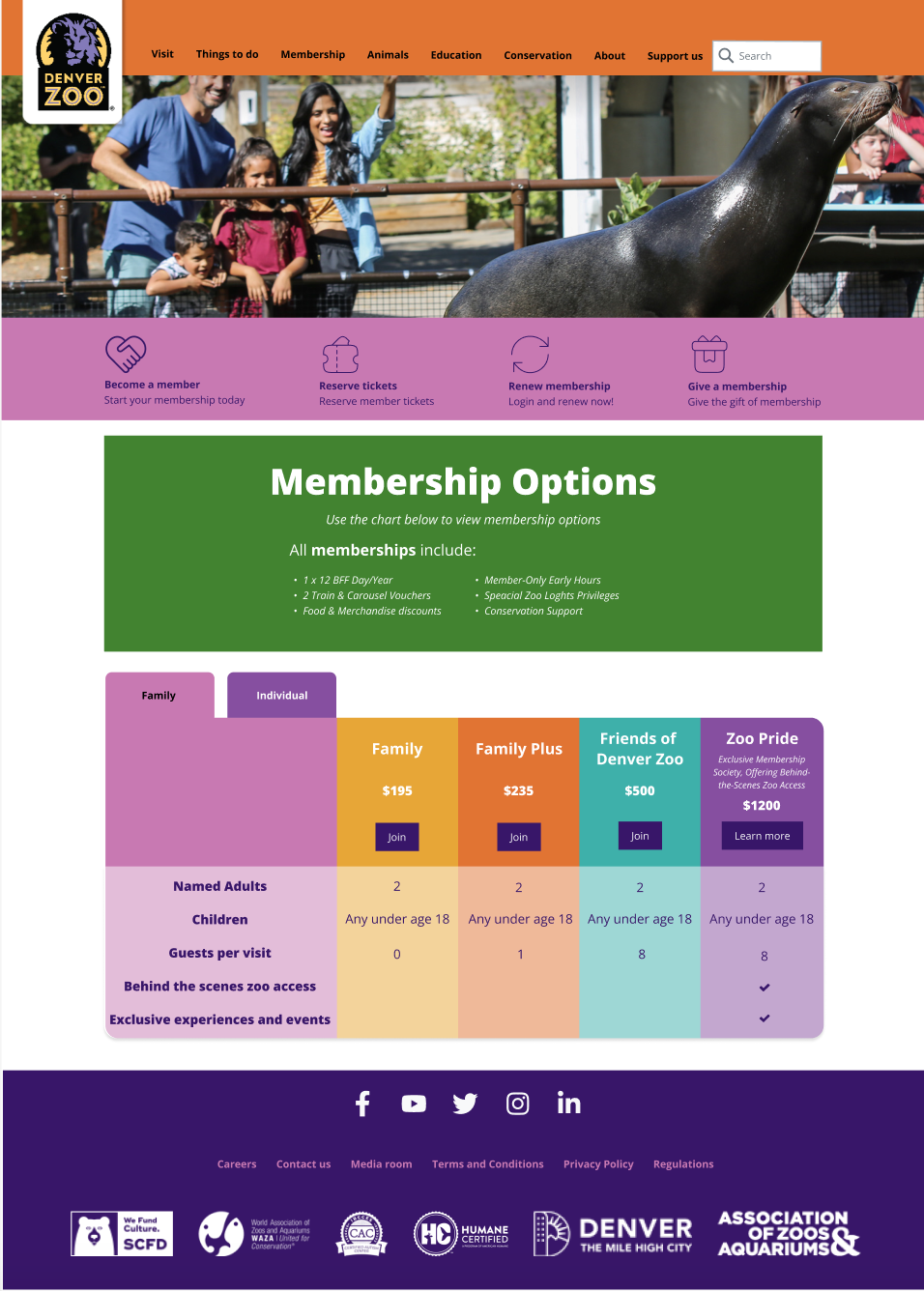
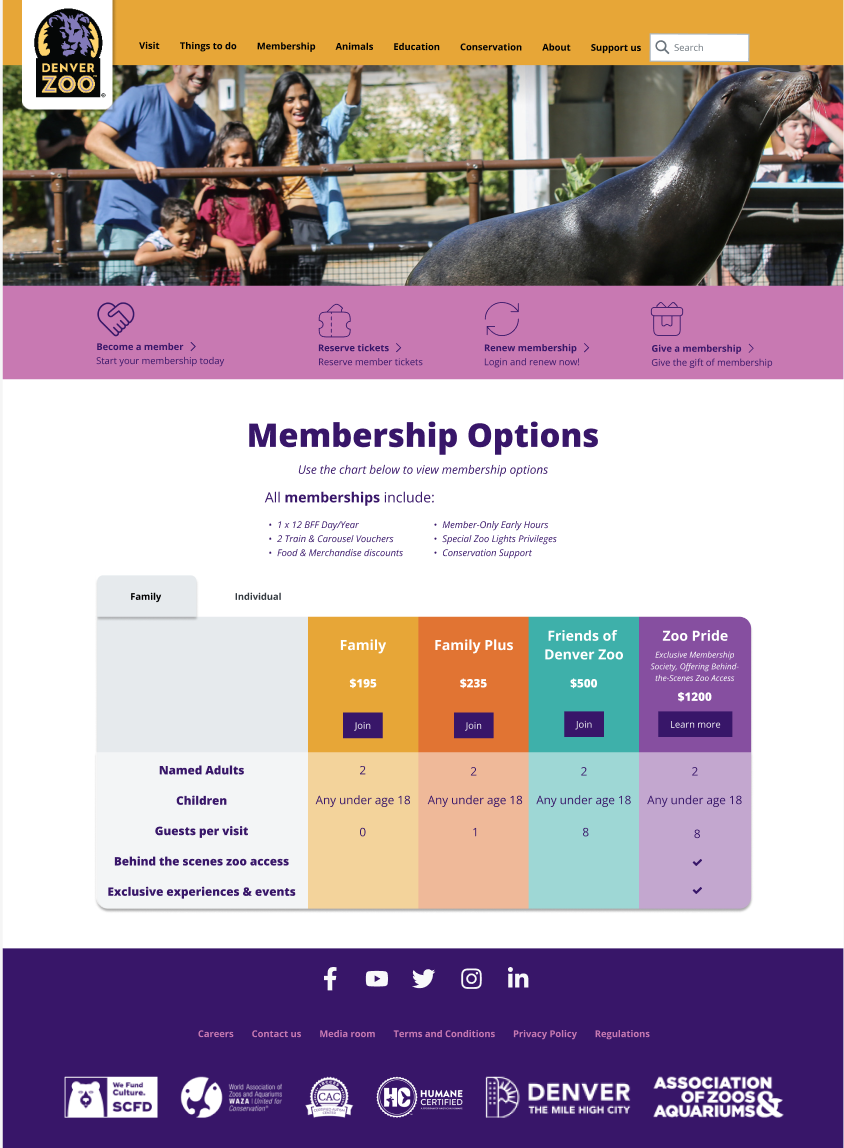
On both the membership and home pages, I added chevron icons to indicate which of these items were clickable.


The ticket flow is where a lot of the feedback changed major elements. One of the repeated pieces of feedback was to get rid of the large boxes that were outlining every different sections of the page. Doing so really opened the page up more and gave it a more professional feel.
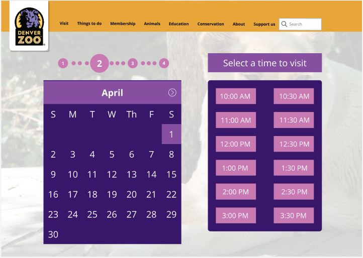
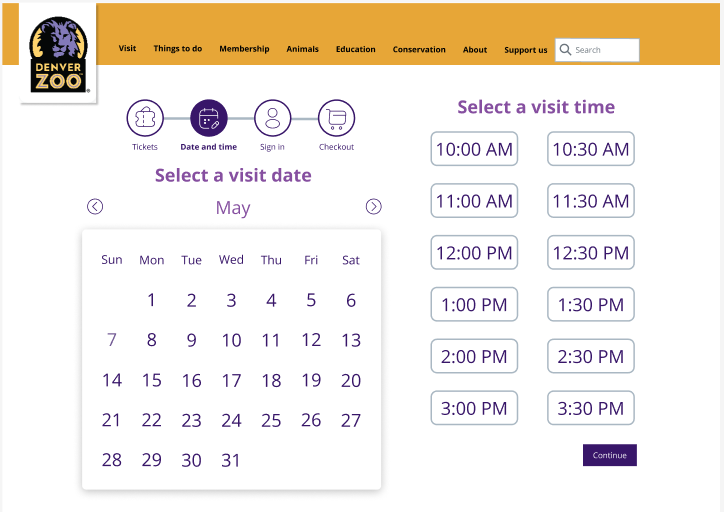
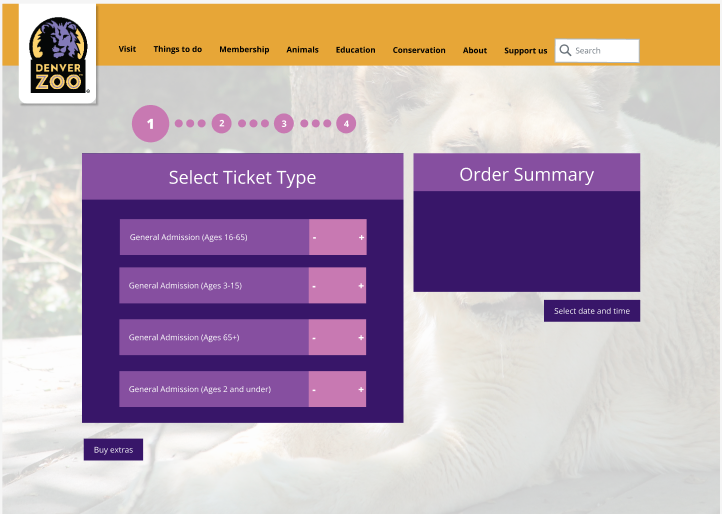
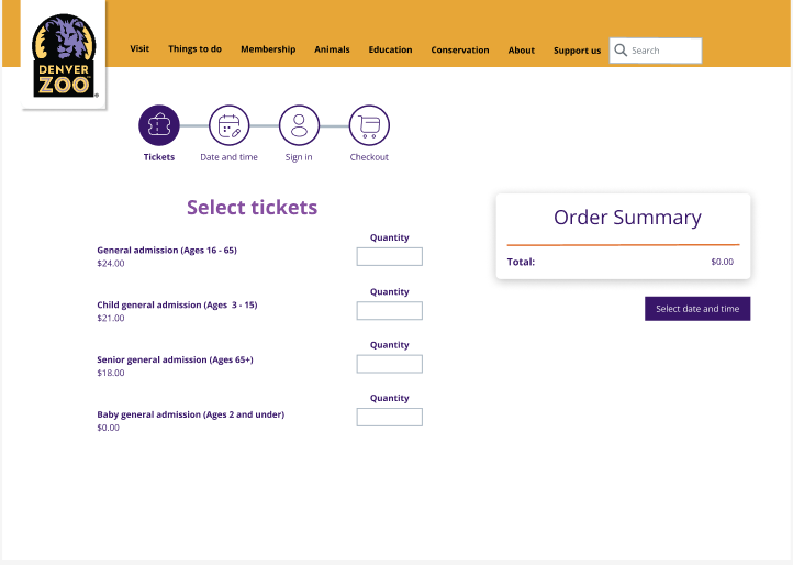
For payment methods, I didn't add the portions where their user had to enter their credit card information. In order to have a completed high fidelity wireframe, I needed to addd this.
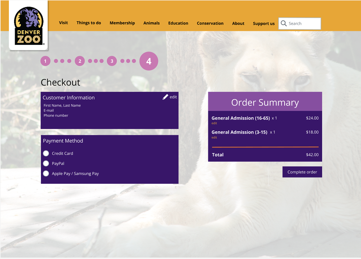
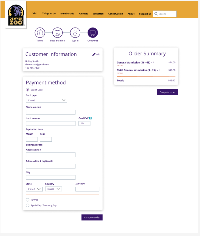
In the sequence of actions bar, not only did I change the dotted lines to solid lines (which was suggested in feedback), but I also added icons and descriptions to each step to provide a more user friendly experience.


There was a lot of other feedback that I took into account when redesigning my original redesign of the Denver Zoo ticket flow.
You can view the entire high fidelity wireframe here: https://www.figma.com/proto/DcSwy9gyup6fhVMaPww92e/Anika-Hagen?page-id=0%3A1&node-id=52-6240&viewport=407%2C-206%2C0.06&scaling=min-zoom&starting-point-node-id=52%3A6240
Evaluation and Results
User testing process and pain points
Using the first draft of my high fidelity wireframes, I completed user testing with three different users. Each user was asked to click through the high fidelity wireframes at their own pace with me guiding them through different instructions. Below you can see some of the notes I took during this testing.
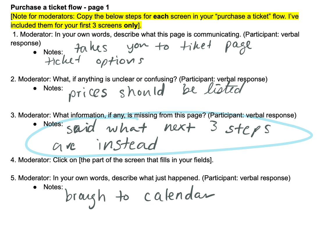
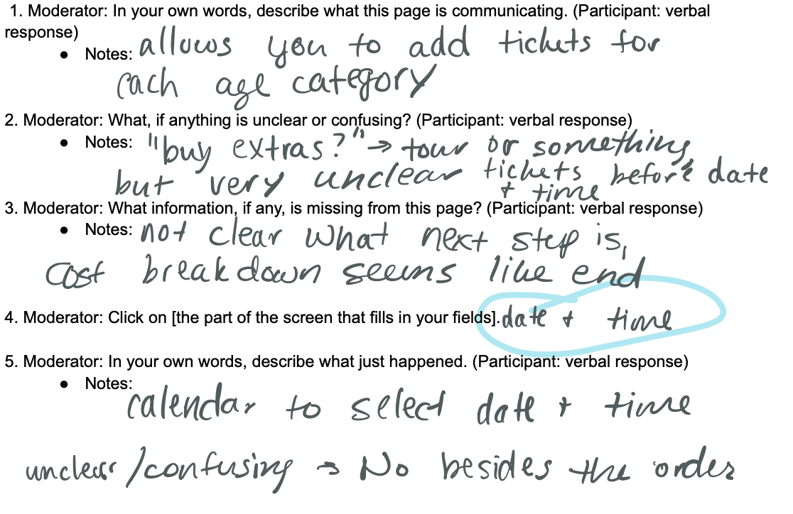
Through user testing, I was able to identify some key pain points that user had mentioned. One user pointed out that there should be labels under each checkout step. I added this. Users did not like the ticket flow order. They especially thought the sign-up/in page was unnecessary and annoying. I think I will either move this page to the beginning of the flow or change the button name to get to that page. Users also agreed that they would like to select dates before selecting tickets. I don’t know if I will change this yet as it could lead to problems with dates not being available for the number of people they want. When it comes to the ticket selection page, users believe each ticket should have a different name to ensure they can differentiate between the different types of general admission tickets. Currently on the Denver Zoo site, the tickets all are called general public, but I may change this. Additionally, the prices of each type of ticket should be listed next to each to avoid confusion, and I will add this next to the ticket names.
Reflection
Future Plans
If I was given more time on this project, I would like to try to implement what the different users I spoke to wanted changed. I spent a lot of time reworking the ticket flow portion of the site when I feel like the membership page could use a lot more time than I gave it. I only updated some colors on my second draft of that page. I really want to try to get all of the different pages to match my new redesign of the ticket flow. I would like to implement more whitespace and a tasteful use of colors.
Conclusions
Throughout this process, I learned that there is a lot that goes into redesigning a website that already exists. One of the hardest parts for me was trying to breakaway from what the zoo already had in place to create something that was my own. This was especially relevant in my first draft of the ticket flow. I wanted all of the crazy colors to stay the same and consilient throughout the site, when really that is not what was best for the website. The next time I am to redesign a website, I think I will use the low-fidelity wireframes to my advantage and make a few drafts of those and really thinking everything out before moving to high fidelity.
